Category: sustainability

  • Designer Margrethe Odgaard about process and color

    Designer Margrethe Odgaard about process and color

    Danish designer Margrethe Odgaard’s exhibition was on view at the Design Museum in Helsinki during this summer. An introduction to her work put the creative aspect of design in focus. Odgaard’s study of color and the cultural signification of it is very relevant and timely for innovative design conversation, in which we are looking for perspectives that see beyond the pure form.

    It feels timely to give design process a platform, which naturally builds discussion about contemporary creative culture. In the world of high tech platforms, we may say that the DNA of design can be found in those practices, which designers organically share with the world in which they live. Without the personal and playful approach, perhaps the future of design would find itself in trouble.

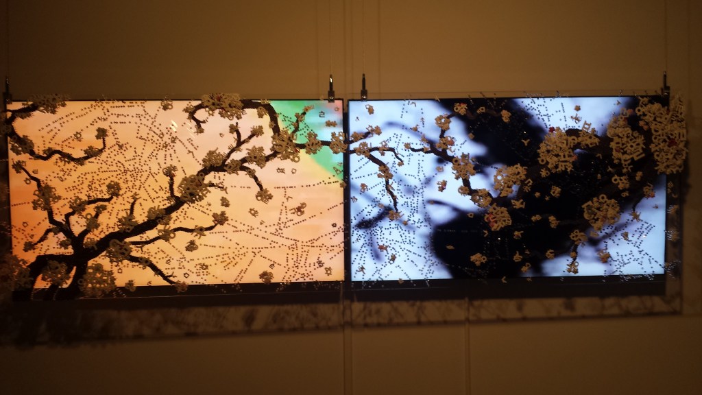
    The Helsinki exhibition featured Margrethe Odgaard’s collaborations and use of materials bringing forth an idea of process. What it highlights is that design should not abandon creativity and art. Margrethe Odgaard was assisting late Louise Bourgeois in the artist’s large scale work, which she created for MoMA in 2005-2006. The young designer learned from this experience with the famous artist. Bourgeois shared an approach that artist has to believe 100 percent in the work, even if the outside world is not able to see the same thing. According to her, ideas and vision come with a careful attention to detail, and from a non-compromising attitude.

    In the future, Odgaard hopes to work more from her own studio base, and focus on the quality of the materials and colors. There is still huge call for colors in our contemporary cultural environment. Tactility of design does not come to mind as a top priority, and the colors still belong to a neglected area in the design world and architecture. Odgaard’s dream is to bring colors back to the black and grey field of architecture, which she frequently collaborates with.

    Odgaard’s design can appear as minimal, yet playful, featuring bold ideas and patterns. It is important for her that the work has emotive response from various audiences. She hopes that the designs bring comfort and energy to our everyday life. Colors have so much potential to give birth to moods and create different atmospheres. Odgaard has focused on the cultural context of colors. She traveled to Japan in 2015, and to Morocco in 2016 investigating culturally specific domains for colors. The designer aimed to find out if there are specific ways to code the local colors from architecture and objects that are attached to particular places.

    Odgaard trusts that as a younger generation Scandinavian designer, she is aware of the craft that carries a long cultural history. This means that she is able to add on the existing knowledge, and offer solutions to design questions and problems, which can be both beautiful and functional. At the heart of her color thinking is The Popsicle Index, which she created as a tool. It comes out in rich color hues that appeal to the senses and relate to the body.

    dm_popsicle-index-1_photo-andreas-omvik
    Margrethe Odgaard wanted to create a color system as an alternative to Pantone color system.

    Copenhagen based Odgaard studied at the Royal Danish Academy of Fine Arts and the Rhode Island School of Design in the United States. After graduating in 2005, she worked as a textile designer in Philadelphia. Before opening her own studio in Copenhagen in 2013, she also designed in Paris. In 2016, the designer received a prestigious Torsten and Wanja Söderberg Prize, which is the largest design prize in the world.

    Muuto shoot
    Margrethe Odgaard sates that colors and textiles can make together strong combinations, leaving an impact that is speaking to feelings as much as to eyes.

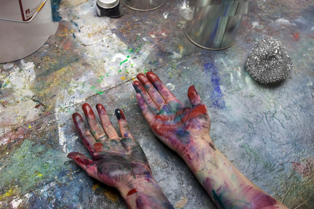
    The textile designer looks for the purpose behind the design, and confirms that it should be always clearly attached to the process. The product is the end result of what the process entails. Margrethe Odgaard keeps diary of the colors which are inspirational for the designs. Details of colors have become a crucial part of her process. Nuances are extremely important, and the diary is a great tool as part of the investigation. Results are far away from being shy. It is truly a matter of sharing as well.

    “Share your knowledge, ideas and skills without hesitation. Be specific to order to become general. Use good tools and create new if necessary. Think through your hands. Free yourself from the limits of coolness. Allow things to evolve in their own pace. Listen. Laugh. Dance.” – Margrethe Odgaard.


    Margrethe Odgaard’s exhibition was on view until August 28, at the Design Museum in Helsinki, more info:

    www.designmuseum.fi.

  • The magic of Hanji

    The magic of Hanji

    Re:visioning HANJI exhibition showcases artworks made from Korean traditional paper hanji.  Two artists, Ran Hwang and Aimee Lee, have each developed their own contemporary aesthetics and styles based on the traditional modes of mastering the paper in artistic forms.   The exhibition is on view until March 31 at the Korean Cultural Center in New York, and connects to the Asia Week New York.

    In the old days, the masters of the Korean paper manufacturing were called jijang. This profession was proudly inherited and passed on to the next generation. The art of Korean paper making is a complex production process starting with a fiber of mulberry tree. It has developed into multiple use of materials and techniques that are still valid today. Historically, paper was not only applied into books, but its role was more daily as functional material in architecture and clothing. It was also part of making calligraphy, painting, money and armor. The remarkable part of early Korean paper manufacturing was connected to Buddhist scriptures.

    The paper process starts with harvesting. A year old mulberry fiber is harvested during the time of November – February, when the plant has enough moisture and the fiber is soft. The skin gets steamed right after harvesting to make a peeling process easier. The entire making is ecological and does not harm nature in any way. After washing and drying, boiling, and peeling cycle, the fiber is used to make hanji. Then the project involves beating the fiber so paper will become thinner and tougher. Finally, the fiber needs to be dissolved and sieved into paper.

    Jiseung is an indigenous art form that Koreans have practiced for hundreds of years. It evolved from hanji; when books were printed and bound, the trimmed edges were saved and used further in making baskets and decorative items. The paper rope became popular, because it was softer than straw, but as strong, and available for use. Many of the traditional pieces have gotten lost through wars and modernization. Yet woven hanji artifacts still include everyday items such as shoes, baskets, wallets, backpacks, and lanterns. For young Korean-American artist, Aimee Lee, the idea of 100 percent hanji includes making the paper herself. She then weaves and naturally dyes the materials used in the artworks. Eventually her objects take a form from the traditional dimensions, gestures and environments. Lee says that her pieces borrow from the historical artifacts. The wedding ducks, which were traditionally given to Korean bride and groom, are one example of this long history. The artist plays with the proportion and shapes creating unique contemporary versions of the objects. She states that none of the original materials went to waste, because paper was so durable and labor intensive to make. Repurposing the paper is a way to connect to the tradition and stories. Paper was carrying secret messages during war. People made sandals out of civil service examinations and other certificates.

    My main material is paper and my central concern is how we use it. I make paper with abundant native and invasive species, which involves harvesting plants, stripping and cooking, processing into pulp, forming sheets, and drying. With this paper, I make thread, sculpture, books, drawings, prints, installations, and performance components. Aimee Lee


    Aimee Lee, objects from Hanji Ducks and Pot -series. Corded and twined hanji.
    Aimee Lee, objects from Hanji Ducks and Pot -series. Corded and twined hanji.

    Korean-born, internationally acclaimed installation artist Ran Hwang creates poetic pieces out of materials that are deployed in fashion industry. She uses handmade hanji buttons to create monumental pieces in installations that display iconic images. Her 9 feet tall work that displays Eiffel Tower and Triumphal Arch, required hours of securing handmade materials on plexiglas panel. The Beginning of the Bright piece, includes also Hangeul, the Korean alphabet. The work was displayed in Paris at the UNESCO headquarters to celebrate Hangeul’s designation as world cultural heritage. For Hwang, the lengthy hours of making the works means hammering each button on pins for approximately 25 times. The work is like meditative ritual similar to those of the zen-masters who concentrate on their practice for hours at a time.

    Ran Hwang, The Beginning of The Bright. Hanji Hangul Buttons, Pins on Plexiglas, 2015. 86.6 x 106.3 inches.

    Hwang creates three types of series, including, the plum blossoms, the birds and spiders, and architecture. The blossoms refer to ephemerality, to the endless circulation of life, which flowers depict when growing and falling. Architecture, like palaces, are symbols of power, which in the art also imply tragic events like invasions and deaths. The small creatures, birds and spiders, represent states between restriction and freedom, implying a constant flux and wandering in life. The artist states that all her work is in a state of fluidity. Nothing is fixed or permanent. The art evokes a dialogue between fleeting and the eternal.

    Ran Hwang, Contemplation Time, Paper Buttons, Beads, Pins on plexiglas, 2014.


    The combination of endurance and ephemerality is at the heart of my choice of using buttons as the primary medium. I hammer thousands of pins into wooden or acrylic panels with my bare hands. The process of creating these large installations is time-consuming, repetitive, and labor-intensive. Thus, the production process is a meditation for me to visualize a cosmological amount of time, and de-installation process is to end the cycle of life and start a new cycle.  Ran Hwang


    Ran Hwang: http://www.ranhwang.com

    Aimee Lee: http://aimeelee.net/

    Korean Cultural Center: http://www.koreanculture.org/

  • Eliasson’s ice revisited

    Eliasson’s ice revisited

    Ice Watch will open to the public on Thursday, 3 December 2015, in the Place du Panthéon in Paris. This artwork by Olafur Eliasson and geologist Minik Rosing is part of the occasion of COP 21 at the United Nations Conference on Climate Change.

    Olafur Eliasson is a Danish-Icelandic artist known for his large-scale installation art, which often has a site-specific component. He has also worked with sculpture. The elements, such as light, water, and air temperature are essential parts in the works to draw the viewer into experiencing them as corporeal and sensory.

    Olafur Eliasson is not a newborn to the climate change issue; neither is he using blocks of ice for the first time in his installations. He has created interconnected works that are close to environmental happenings, proposing an innate sense of activism. How to catch great attention and international visibility with earthy and conceptual works, is his niche. Perhaps Eliasson artistry sometimes implies great attention with metaphysical value, but this fact is by no means discarding the materiality and tactility of the things. Perception and comprehensibility of larger subjects, particularly that of a climate change are very much embodied in the projects.

    Taking the icebergs, which predominantly float far away from our sight in the isolated North are now taken seriously. Eliasson brings a hint of their monumental presence along with him putting them down on the marketplace of a metropolis, across the street so to speak. Let the ice melt there in front of our eyes to remind how the world is running out of time with the climate change, and how things truly are physical. We live in a physical world. In 2014, Eliasson installed the show in Copenhagen. The ice was placed in the middle of the town square, lifting the local spirits to think about the fjord water in the north. In 2013, at PS1 of MoMA in New York City, another work of this kind “Your waste of Time”, had ice pieces that arrived from the Iceland’s largest glacier, Vatnajökull. Visitors had a chance to observe and discover the melting ice.

    The project, which is installed in Paris recalls the title “Ice Watch“. The metaphorical piece has a power to speak of the ice that is speedily disappearing due to the global warming. Eliasson has stated that he is interested in giving knowledge a body, to encourage action on an everyday social level. What is sure is that everybody in the recognition of the global warming is going to be involved in the process. The artwork addresses it to the world, and thinks of it from the perspective of the future generations.

    The physicality of the ice is remarkable because it stands for the longer life spans. Ice is older than us, who dwell here. For the installation, there are twelve large blocks of ice that come from free-floating icebergs in a fjord outside Nuuk, Greenland. They are arranged in a clock formation on the Place du Panthéon. Weighting around 80 tonnes, the ice will melt away during COP21.

    … … …

    Origin: Nuup Kangerlua fjord outside Nuuk, Greenland
    Transport: Organised by Group Greenland / Greenland Glacier Ice, the ice was collected by divers and dockworkers from the Royal Arctic Line and then transported in six refrigerated containers from Nuuk to Aalborg, Denmark by container ship and to Paris by truck. Ice Watch is supported by Bloomberg Philanthropies and realised in collaboration with Julie’s Bicycle. Ice Watch is part of the initiative Artists 4 Paris Climate 2015.