Tag: eco fashion

  • Fashioning ‘eco’ concepts

    Fashioning ‘eco’ concepts

    If fashion is now promoted with both ecological values and celebrity cultures, a question of who is wearing what and whose designs, includes a new kind of conceptual thinking.  Historically, fashion is the clothes that we are wearing. Then, a questions of social class plays an important role, since we are making the clothes our own by wearing them. Traditionally, women have been thought to be the ideal consumers of fashion, so fashion magazines have also created platforms where to discuss and make fashion as part of the women’s lives. In the circulation of fashion, clothes become fashionable again when the trends come back as new combination, and also next to new concepts and ideas. The historical, futuristic, and the near-past fashion are re-produced together with popular cultural icons. The cultural references of fashion keep also changing so that they are able to maintain the ‘hype’ status attached to classical designs. New technologies used in the fabrics, as well as green values are  important factors, which also reflect the moment. More importantly, ecological aspects that promote global awareness and respect the local traditions are now a necessity.

    When in previous decades, the fashion products (and other products) did not take into consideration the ecological dimension of production, today’s processes are very different. The economics behind the change is pricing, as the prices in materials have been rising. Then, today’s consumers cannot be entirely responsible for paying the high cost, so the companies and designers have to be able to reduce the amount in production, and reconsider the materials, which they use.

    When we are making our choices as consumers of fashion, more important to us than who is showing up in the shows is to be a conscious consumer. We should be asking, what is the ecological dimension behind the clothes that we buy. In addition, a cultural and geographical referent can become a conscious factor in our decision making; when in the making of the products this means emphasizing the local craftsmanship. One example of this type of local fashioning is a collective Contept Korea that has utilized an idea of Korean fashion culture in their global marketing. Designers who are participating in the collective aim at making Korean cultural image and national competitiveness as their goal. The Korean fashion, which has been promoted overseas has been sponsored by the Korean Ministry of Culture. With that governmental aspect, Concept Korea has been looking for new forums to promote Korean fashion and culture together, and to interact with new technologies. I participated in their showing in Mercedes-Benz Fashion Week in New York in February 2011.

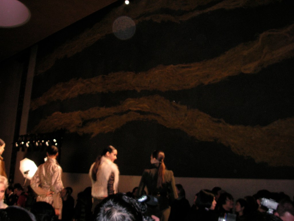
    One of the designers Lie Sang Bong (based in Paris), has been drawing inspiration from Korean folk painting, from the black and white graphic designs which have drops of bright color like red in them. He has also created fashion sculpture and a bauhaus-architecture inspired collection, which both show sculptural dimensionality in clothing. Then, a Korean woman designer Doho impresses with work that has a feminine and flowy touch (see picture from Mercedes-Benz Fashion Week in February 2011). Concept Korea perhaps comes as a continuation of the collective creativity that started with Seoul being the World Design Capital in 2010.

    In today’s economical climate, the design world is thinking alternative solutions. When European countries struggle with economical difficulties, a good news could be that the countries are re-thinking the carbon limits in the production processes.  Only a few decades ago, environmental problems were thought to be part of the policy making of the governments. Now the industrial processes are considering the environmental questions as part of their designing of products.

    Designer Lie Sang Bong with his crew at NY fashion week.
  • ‘New Nordic Oddity”?…and other design definitions

    ‘New Nordic Oddity”?…and other design definitions

    What I find very intriguing in the current design-discussion, is the questions of how we signify the things, and how we see the world-object -relations from different points of view. What now seems timely, is to define and differentiate ourselves as consumers with more softer values. We are ‘humans’ after all, meaning that we are responsible of the planet, therefore, what kinds of significations we give to the things and objects in the era of mass-production is crucial. How we consume, how we define what we consume, how we differentiate things, adds value to the objects. The meaning-systems behind the branding of products are referential, but they are also truthful from the point of view that they engage our participation in the entire definition-game. As it is also true that what kinds of nouns and adjectives we give to the objects, puts them on the market more.

    Where comes a need to define the objects, which we use, which surround us, and so on? A question is relevant in relation to design, since we incorporate the objects in our daily lives. That is the pre-value of the design. ‘National’, or should we say ‘regional’ or ‘geographical’ instead of a national as we share a global world, is attached to the design-products, and calls for several attributes. This is strongly the case in the branding of Finnish design. Let’s look back to 2008.

    The summer of 2008 generated an exhibition of Finnish design in the Helsinki Design Museum. The exhibition was called Fennofolk-New Nordic Oddity. One of the exhibit curators, professor Timo Salli from the University of Art and Design in Finland, told the newspaper Helsingin Sanomat that the Fennofolk-New Nordic Oddity -exhibition aimed at honoring the local Finnish culture. It tried to find “weapons” from the Finnish culture. Additionally, Salli mentioned that the show was not trying to bring in the latest trends from Paris to be shown “too late” in Finland, but when viewed from the “Slavic-urban” perspective, the contents were precisely that of the “national romanticism” (Pöppönen/HS 11.6.2008).

    In the interview, it became evident that the fennofolk idea had been invented couple of years prior to the show together with Salli and co-artists Jari Leinonen and Paola Suhonen (founder of Ivana Helsinki brand). Fennofolk-New Nordic Oddity displayed works from 80 different artists, who deployed a great variety of media in their works, not just birch and birch bark, which are the traditional folk art materials that Salli himself used in his exhibition designs.

    What inspired me immensely about the show itself, and what also captured my curiosity when I read Salli’s interview,  was the idea of design branding; the core idea of how we choose to define the objects and things, give them certain value. And look at them in respect to our own pasts, weather it is local histories or our own experiences in Finnish forests, for example. The beauty of the Fennofolk-New Nordic Oddity is hidden in the paradox. Finland is, first, a culture of the ‘fenno’, what ever that means. At least it comes with the traditional methods of designing the birch. Second, Finland seems to represent in the design imaginings some kind of New Nordic or Northern Oddity, which could mean something Nordic (as it is part of the Nordic countries) and then something New (as exiting?). What remains is the definition of Oddity. A question remains, what would that be? How do we define Oddity in relation to Finland and its designs?

    Helsinki World Design Capital might come up with some answers…

    See also Paloni Designers on this blog

  • Would I buy a ‘poisonous’ handbag…

    Would I buy a ‘poisonous’ handbag…

    Marketing strategies are sometimes tricky, and techniques of seduction are part of the contemporary branding of products. Putting products out on displays, is then of course part of the entire strategy. We are sensuous beings. Consuming today means taking seriously the product differentiations. We should be paying attention to, how the different products feel, taste, smell, etc… In other words, a questions is, how we as humans experience and imagine objects and things.

    What is the tricky point is that we are after all quite childlike beings when we make our choices to buy something. Hopefully our product differentiation is more in line with the future aspect; what would be good for us in the long run and what would be a more sustainable aspect in our buying of new things. This relates to, what is good for the environment and does not poison our bodies.

    It is important to emphasize couple of questions: how much of the seduction in the advertisements, and in the product differentiation is based on the use of different color-combinations? How do the various techniques of branding speak to our sense of nostalgia aiming at reminding us of our childhood experiences, the shapes, designs, colors and patterns? I noticed something based on this idea.

    There was a handbag, which was on display on a ‘poisonous mushroom’. Think of the red-white spotted Amanita. The color combination would be just so inviting, so deliciously right. The color and shape is full of associations, which can be traced to children’s books and other childhood designs…Just imagine Alice’s Adventures in Wonderland  (by Lewis Carroll). What actually happened to Alice? She was growing tall, shrinking…The image appears as both fascinating and scary. We do not necessarily need to know what happened to Alice in the story. Yet we should think about the poisonous as a metaphor for things that work in the level of seduction… An important question would be, as I see a beautiful handbag on display, would I buy it as it is on a top of a poisonous mushroom? What else does ‘the poisonous’ stand for in the contemporary consumption imaginings, what are the materials used in the products; do they harm the environment and so on?